
Hello all! Today I'm participating in the Hero Arts March 2017 My Monthly Hero blog hop and sharing chic herb card set!
I know you're gonna be seeing a lot of bunnies from the main kit today, so I decided to show off the beautiful add-on, Fresh Herbs.
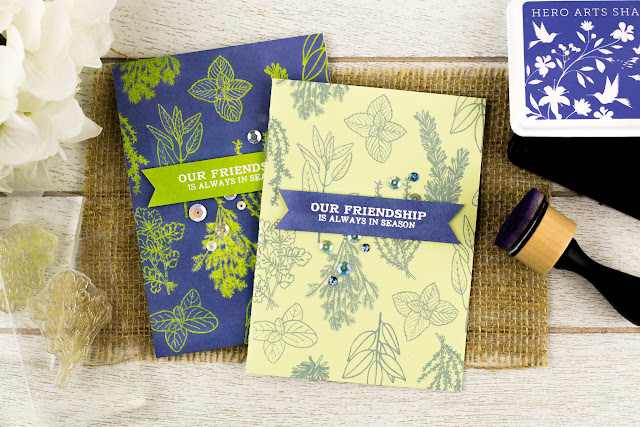
For my first card, I stamped all the images in Dusty Blue on a light green card base.

To make sure my sentiment panel matched the ink, I covered a piece of cardstock in Dusty Blue, heat set it, and then smothered it with anti-static powder before embossing my sentiment.

I think that Dusty Blue is just one of the prettiest colors - it's so interesting! Not quite blue, not quite purple - works for different moods, which means it's perfect for me!
Because this stamp set makes me think of something you'd find at some chic stationary store, I wanted to make a matching card. This second card took way longer to make, but I think the pair of them are quite fetching and worth it. ;)

To get the colors to match with the first card, I had to do some tedious stamping. Here's the step-by-step process:
The kit is available for a limited time only - once it's gone, it's gone. However, you can now subscribe to receive the kit monthly and never miss one! Kits begin shipping from Hero Arts on Friday, March 10th.
For loads of inspiration and a chance to win a prize, follow this hop! You should have arrived from the amazing Wanda Guess, and the always stunning Debby Hughes would be next on the hop, after me:
Hero Arts is giving away one kit as a prize to one blog reader - selected from the comments across all of the blogs in the hop. Giveaway closes Sunday, March 12 at 11:59pm, and the winner will be announced the following week on the Hero Arts blog.
I know you're gonna be seeing a lot of bunnies from the main kit today, so I decided to show off the beautiful add-on, Fresh Herbs.

For my first card, I stamped all the images in Dusty Blue on a light green card base.

To make sure my sentiment panel matched the ink, I covered a piece of cardstock in Dusty Blue, heat set it, and then smothered it with anti-static powder before embossing my sentiment.

I think that Dusty Blue is just one of the prettiest colors - it's so interesting! Not quite blue, not quite purple - works for different moods, which means it's perfect for me!
Because this stamp set makes me think of something you'd find at some chic stationary store, I wanted to make a matching card. This second card took way longer to make, but I think the pair of them are quite fetching and worth it. ;)

To get the colors to match with the first card, I had to do some tedious stamping. Here's the step-by-step process:
- Using the mini MISTI (if you have the larger one, it would work better), I used Green Hills to stamp as many of the images as I could fit onto some white cardstock that I had prepped with anti-static powder.
- Not removing my images from the MISTI, I cleaned them off, then used Versamark to stamp the images again. NOTE: I have an Ugly Betty Versamark pad - I use it purely for stickiness and don't worry a whole lot about getting ink on it.
- I then added some Clear embossing powder, heat set the images, and then repeated these steps until I had my entire background covered.
Once I had all my images embossed, I covered the cardstock with Dusty Blue, applying the ink pad directly on the paper, and using an inking tool to get into any nooks and crannies.
I then wiped off the excess ink with a wipe, and oila! A background!


I tried saving myself all the steps by just heat embossing in clear on the green cardstock I used for the first card, but because the cardstock is coated, the Dusty Blue didn't show up quite as vibrant.
However, to save yourself from double stamping, you could use some quality light green pigment ink. The pigment ink will provide the color and also the stickiness needed to heat emboss.
For matching sentiment banner, I covered a piece of cardstock in Green Hills, and then heat embossed my sentiment from Egg-cellent (also a new add-on this month) in white.
I topped both cards off with some sequins and adhered the sentiments with adhesive foam.
This month's kit includes:
The kit value is $75, an amazing deal at $34.99.THE KIT
This month's kit includes:
- 2 4"x6" clear stamp sets
- 21 coordinating Frame Cut metal dies
- 2 Fancy Dies
- 2 5.5"x8.5" sheets of Chocolate & Herbeus cardstock (brown & green textured cardstock)
- 1 6"x6" sheet of teal marble paper (color may vary)
- 1 5.5"x8.5" sheet of burlap
- 1 Intense Black ink cube (ideal for use with alcohol markers)
The kit is available for a limited time only - once it's gone, it's gone. However, you can now subscribe to receive the kit monthly and never miss one! Kits begin shipping from Hero Arts on Friday, March 10th.
HOP
For loads of inspiration and a chance to win a prize, follow this hop! You should have arrived from the amazing Wanda Guess, and the always stunning Debby Hughes would be next on the hop, after me:
Hero Arts is giving away one kit as a prize to one blog reader - selected from the comments across all of the blogs in the hop. Giveaway closes Sunday, March 12 at 11:59pm, and the winner will be announced the following week on the Hero Arts blog.
SUPPLIES
Cardstock: Hero Arts Foliage Layering paper, Michaels white cardstock (the non-weird kind)
Stamps: Hero Arts Fresh Herbs and Egg-cellent,
Ink: Hero Arts Dusty Blue and Green Hills, Versamark
Other: sequins, Hero Arts White and Clear embossing powder
Tools: heat gun, ink blender
Love both colour combos! Jo x
ReplyDeleteSuch an awesome idea, and the result is jaw dropping gorgeous. Thank you Clare for sharing your inspiration!
ReplyDeleteSo pretty! Very inspiring. Can't wait to get my kit.
ReplyDeleteThey're lovely! Thank you for the inspiration. Take care, Kim :)
ReplyDeleteSuch pretty cards! I love how you heat embossed the images....love it
ReplyDeleteStriking blue and green combo, Clare =)
ReplyDeleteLovely card! The blue and green together look amazing!
ReplyDeleteBoth of your cards are so lovely. I love how you used clear embossing on the second one and then inked the background... Love the lime and blue together!
ReplyDeleteLike the colors you chose for the cards!
ReplyDeleteI'm confused... my dusty blue is much lighter than yours?
ReplyDeleteLovely color combos! The herb stamps are so fresh and fun!
ReplyDeleteJust love both cards, Clare - what a great background you've created with the herbs!!
ReplyDeleteBoth cards are lovely but the green on the blue is really striking. So fresh and vibrant.
ReplyDeletelove the colors!!
ReplyDeleteI love your use of stamps to make a background. Both wonderful cards, but the second is particularly eye-catching.
ReplyDeleteOh I love your cards. The colours are just beautiful. Thank you for the inspiration.
ReplyDeleteTake care
Tracy
Love seeing stamps used to create backgrounds! Very beautiful cards
ReplyDeleteThis kit is marvelous and one lucky winner is going to be so excited to win it.
ReplyDeleteJust lovely Clare and the sentiment is beautiful!
ReplyDeleteWhat cute cards, The herbs are my favorite from the release
ReplyDeleteThe herbs combine to make an awesome book front!
ReplyDeleteThe card is nice and simple, but it makes a bold statement with the color choices.
ReplyDeleteThanks, Erica K.
The cutest kit ever! Love your herb cards.
ReplyDeleteoh its very pretty!
ReplyDeleteWOWSERS! Your green and blue color combo is just gorgeous. I just love the herb stamp set too. Thanks for sharing ;)
ReplyDeleteLove the use of stamps for the backgrounds! Terrific!
ReplyDeleteThe colors of the cards are just my style, love the herb set.
ReplyDeleteLove your cards! The colors and designs are great. Funny...I have that same kind of Versamark ink pad!
ReplyDeleteIt does remind me of designer stationery! Beautiful.
ReplyDeleteFantastic idea! Love the cards!
ReplyDeleteBeautiful cards!
ReplyDeleteI really love what you have done with this kit, so beautiful, I am definitely going to have a go at making these cards xx Thank you for the inspiration xx
ReplyDeleteCute cards!
ReplyDeleteGorgeous Cards! Love what you have done.
ReplyDeleteWonderful cards!
ReplyDeleteLove the bold colours together! Beautiful!
ReplyDeleteBoth cards are fabulous, but I <3 that blue one!
ReplyDeleteI love both cards but will probably do the easier one. Lovely. Thanks.
ReplyDeleteLove the blue and green together
ReplyDeleteLove your color combos. Love that gorgeous blue too. Very nice cards.
ReplyDeleteBeautiful card.
ReplyDeleteOoo I really lvoe the look of your blue background. Very cool
ReplyDeleteWoW! I don't even want to think about what all went into doing a "reverse color" card, but it was worth it! Totally cracked up over "ugly Betty," I hadn't heard that one, but I can relate! I keep making a mess of mine. Fortunately, I don't do too much embossing, and I managed to snag a bunch of embossing ink pads off a clearance rack, so I have back-ups when I need a pristine one! Thanks for sharing this fun one.
ReplyDeletePretty! Love the color combo!
ReplyDeleteVery n8ce, love your choice of colors.
DeleteI like your cards but that green on that blue is spot on gorgeous. I love that color combo and the card.
ReplyDeleteThe color combinations are amazing!
ReplyDeleteLove the herbs add-on to this kit. Your color choice is perfection! TFS
ReplyDeleteLove the color scheme!
ReplyDeleteI was ready to say the same thing as Cynthia above me! The blue green combination is great! Like the design, too.
ReplyDeleteVery pretty I love the green and blues. I also love the one with just embossed images. Great look.
ReplyDeleteLove the color combinations you used.
ReplyDeleteLove the colors on this fabulous card!
ReplyDeleteThat navy card with bright green ink is to die for! Beautiful card!
ReplyDeleteLove the colors you have used with the herbs. So unique!
ReplyDeleteVery pretty cards!!
ReplyDeleteLove the colors on this pair of cards.
ReplyDeletePretty cards
ReplyDeleteWhat stunning coloured card combinations! The blue is my favourite because of the high contrast but the lighter card is equally as elegant. Fabulous!
ReplyDeleteyou've created such wonderful backgrounds - love all those herb stamps the most in this release!!
ReplyDeleteAlways looking for fresh ideas and you have them
ReplyDeleteI love the color combination.
ReplyDeleteBlue and green is one of my favorite color combinations. Love your cards.
ReplyDeleteLove the fresh herbs stamp set! Thanks for sharing your wonderful cards on the blog hop!!
ReplyDeleteNice color combination for lovely cards! Indeed an all-season stamp set!
ReplyDeleteVERY PRETTY!!!! AND I also LOVE the colors you've used on your cards! PERFECT for Spring! ;)
ReplyDeleteThe colors on your cards is amazing! So beautiful!
ReplyDeleteWOW your color combinations are wonderful, beautiful cards!
ReplyDeleteBeautiful cards. I'm drawn to the one with the blue background. It really allows the herbs to stand out.
ReplyDeleteGorgeous stamped backgrounds! Especially love the green on blue.
ReplyDeleteAwesome card
ReplyDeleteI love the background! Very nice!
ReplyDeleteI love both cards especially the dark blue with the green embossed herbs! Really gorgeous, I can't wait for mine to come!!
ReplyDeleteI don't usually buy kits...but I'll have to make an exception with this adorable kit. Thank you for the inspirations.
ReplyDeleteI'm an herbalist and I'm loving what you did with the herbs set!!! Love the vivid blues and greens together.
ReplyDeleteYour cards are wonderful and so is this new card kit!!!
ReplyDeleteWOW! These are both stunning! LOVE the colors ♥
ReplyDeleteColors of both cards are beautiful!
ReplyDeleteBoth cards are gorgeous, but the green on blue is simply stunning.
ReplyDeleteLove your colors, I really like the green on blue best.
ReplyDeleteLove the simplicity of your cards! Love both of them.
ReplyDeleteGreat Cards ! Lovely color choices Thanks for the inspiration
ReplyDeleteI love your cards--what a classic, timeless style! I have to get this stamp set!
ReplyDeleteAmazing cards. Love your design and colour choice.
ReplyDeleteI love your navy and green color combination.
ReplyDeleteWow wow wow, I am just having great fun hopping and admiring all the beautiful work, well done!
ReplyDeleteI wouldn't have thought to use the color combination you did but it worked out beautifully! I just love the herb add-on that goes with this months kit. Thank you for taking the time to share this with us.
ReplyDeleteI love how you used the herbs as a background for your sentiment card! Thanks for the inspiration!
ReplyDeletegorgeous, colorful cards that makes me long for spring!
ReplyDeletesoo pretty
ReplyDeleteAwww!!!! Beautiful cards and colors!!!
ReplyDeleteYour cards are stunning, Clare! Thanks for the great tips and for being part of this fun hop and giveaway.
ReplyDeleteI love your cards, pretty color combos!
ReplyDeleteI love your cards and the how you use the herb stamp set
ReplyDeleteI agree Clare, the dusty blue is lovely and your cards are gorgeous!
ReplyDeleteLove them, awesome colors too!
ReplyDeleteCool new kit! Nice colors used for these cards. Thanks for sharing!
ReplyDeleteAbsolutely love the colors! Sweet cards.
ReplyDeleteGreat use of the new kit and good colors.
ReplyDeleteThanks for sharing.
Your colors and cards make me happy. Love them!!!
ReplyDeleteLovely card! Thanks for sharing.
ReplyDeleteVery cute! I love these colors together.
ReplyDeleteI love the herbs on the dark blue background, just lovely!
ReplyDeleteMy other email (besides my google) is dollface92y@outlook.com Some of the blogs have me signed in with my google account and others ive typed in my outlook email. But just so you know (for the giveaway)... i am the same person and i have checked out and read and commented on all the blogs from the hop as Jennifer Thomas just with two seperate emails... dollface92y@outlook.com and dollface92y@gmail.com
ReplyDeleteNew follower for sure! Ive kinda got side tracked from the blog hop just checked out some of your other work and your blog. I love your style. You are very talented! These two cards are absolutely beautiful! I love the color combos. Blue on green and green on blue... but i think the green on blue is my favorite. Extra work but amazing! You are so talented, Clare! I havent seen the other blogs past yours but believe it or not, i actually havent seen that many bunnies in the blog hop. Lol. I think the other bloggers had the same idea. Jennifer McGuire used both the adorable bunnies and the seed packet stamps but everyone else so far has kept it more on the elegant herbs side instead of adorable bunny side. But from what ive seen, they all are amazing cards from all the blogs and you are all amazingly talented for sure. But the blue card... the one you stamped the herbs in green and clear embossed to be able to cover the white cardstock in blue ink... is amazing! I think its my favorite uve seen out of all the blogs this far.😊
Definitely looks time consuming, but the results are worth it. Beautiful.
ReplyDeleteSimple and elegant. And those colors! Such an interesting choice. Thanks for the step-by-step. I wouldn't have realized the blue card was inked otherwise!
ReplyDeleteWow! That Dusty blue is so beautiful your color combinations is amazing . Who new , love it beautiful card!
ReplyDeleteLovely cards!
ReplyDeleteI love both cards - but I am in love with the dusty blue on the lighter card stock. Very elegant!
ReplyDeleteLove the blue/green card and the idea with the herbs. The sentiment is perfect too!
ReplyDeleteBeautiful colors! Perfect set for a background!
ReplyDeleteThose cards are gorgeous!!
ReplyDeleteI love your pretty color combination! The lime and the lilac look so pretty together and the pattern is just beautiful!
ReplyDeleteJust love this color combination! And the herbs are perfect (I think :D) for these cards!
ReplyDeleteBEAUTIFUL cards! Love the rich background colors!
ReplyDeleteBeautiful, liked how you used the stamps to make a background but also making the the center of the card.
ReplyDeleteGreat color choice!
ReplyDeleteBeautiful Color Combo!
ReplyDeleteVery neat cards...also creative way to create the blue background!
ReplyDeleteboth cards are so lovely!!
ReplyDeleteI love the colors! gorgeous!
ReplyDeleteGreat unique color scheme! I love what you did with the kit/add ons
ReplyDeleteBeautiful color combinations!
ReplyDeleteAbsolutely beautiful cards. What beautiful color combos!! Very classy looking cards.
ReplyDeleteLove your Color combination.
ReplyDeleteThanks,
Linda
Love the herb stamp set even more after seeing your cards. So pretty!
ReplyDeleteThat color combo just screams Spring. The Dusty Blue is so versatile in that it isn't a true blue or purple. I love these cards and the work that went into them. So creative!
ReplyDeleteJust beautiful and well worth all the steps! Thanks for explaining your creative process.
ReplyDeleteI love both your cards and your colour combination is gorgeous, defiantly worth all the steps for the second card. I feel like you could frames these side by side, it would look awesome!
ReplyDeleteYour colour combinations are beautiful! The perfect combination for that great herb stamp set.
ReplyDeleteWhat great color combos! I am really loving this garden theme!
ReplyDeleteThese cards really pop! Great job! Loving the kit this month and all the inspiration! Thanks for the chance to win!
ReplyDelete~God bless~
A little off topic, I'm so curious what the "weird kind" of cardstock from Michaels is, if you used the "non-weird" kind. I frequently use their cardstock. On-topic, your cards are great! Fabulous use of those two colors.
ReplyDeleteI've found at least two different types of cardstock from Michaels that are both sold as the same white. One is a rather garish white, a bit rougher in texture, and doesn't blend my ZIG's as well. The other one is a perfect white (for me!), smooth and blends ZIG's pretty well. So that's the weird and non-weird cardstocks to me. ;)
DeleteLovely cards!
ReplyDeleteOh, my....your colors are just WONDERFUL!!! Love these herb images.
ReplyDelete<3 J
jwoolbright at gmail dot com
HerPeacefulGarden.blogspot.com
So pretty, love those 2 colors together!!
ReplyDeleteThat blue background REALLY makes that ink POP!!! It's totally beautiful!
ReplyDeleteThe blue card is stunning, Clare!
ReplyDeleteI love the blue card, especially in contrast with the other. That double stamping technique worked out great! The March kit has a lot of great items!
ReplyDeleteJust love these cards, Clare. Using the herbs for your background is so right for this sentiment and the two contrasting colors you used work so well. You truly achieved what you set out to do. Thanks for sharing.
ReplyDeleteLove this awesome color combo! Beautiful cards!
ReplyDeleteVery pretty card thank you sharing.
ReplyDeleteThe blue is just perfect.
ReplyDeleteLove your blue hues on the card.
ReplyDeleteFabulous! I am craving for herbs after seeing this.
ReplyDeleteLove your cards, the green and blue is my favorite.
ReplyDeleteLove the color combination.
ReplyDeleteEither way the blue/green is used
is fantastic.
thanks for sharing.
I just love your color combinations, gives me some great ideas.
ReplyDeleteI didn't read any previous comments until I posted mine. So many people left a similar comment.
ReplyDeleteWhat a cool pair of cards! Love it both ways!!
ReplyDeleteyou create an amazing cards!
ReplyDeleteGorgeous cards!
ReplyDeleteYour green and blue card is gorgeous! I have been going to try this technique. I was going to use black ink on the top, since that is the way I had seen it done before. It never dawned on me I can use any color I would like to. I do not have to use black! Thank you for enlightening me!
ReplyDeleteLovely how you just used two colours and the colour combination is great!
ReplyDeleteI love the simplicity of these cards!
ReplyDeletePretty cards and a wonderful background on the blue one - thanks for the explanation on how you did it.
ReplyDeleteLove the clean look of these cards, yet they are so alive with color!
ReplyDeleteI like that stamp set. Your cards are really great.
ReplyDeleteThe green and blue card is gorgeous!
ReplyDeleteLove the color combo!
ReplyDeleteI think the Dusty Blue is now my new favorite! Beautiful cards and I can see a whole set of them.
ReplyDeleteThey do look like stationary cards from a shop! Very cool and thanks for explaining how you applied the background coloring.
ReplyDeleteBeautiful card designs. Love the color combination chosen.
ReplyDeleteThese are two beautiful cards!
ReplyDeletebeautiful cards! Love the color combos!
ReplyDeleteI like the color combo of your awesome card.
ReplyDeleteI love the colors! Thanks for sharing your technique!
ReplyDeleteLove all of your cards but you saved the last friendship card for best. Am definitely going for those color selections and technique!
ReplyDeleteNice cards. Especially like the one with the wreath.
ReplyDelete